Type Tips
First, you need to know a couple of basic things about type, so you choose your fonts wisely:
- See this excellent piece with simple guidelines:
“What Font Should I Use?”: Five Principles for Choosing and Using Typefaces
Type-on-a-photo Tips and Examples
- See these for some good ideas and techniques:
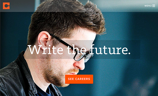
10 Tips for Designing with Type on a Photo - More great ideas for type over a photo:
Headlines and Taglines Set in Subtle and Slim Type - Another using gradients and vignettes to make the text stand out:
Design 101: Using Large Type in Presentations - Graphic Designers have been creating magazine covers for a long time - these also apply to web design:
Tips And Inspiration On How To Design A Magazine Cover
More Examples
Most of these use one or more of the techniques presented above. The sites above also have great examples, so don't miss those. |
| Mr. Christie is a big guy, with a big political presence. By placing TIME behind him, this is emphasized even more. |
 |
| This one also puts the big hair in front of some of the text. The text here makes great use of size contrast. Also notice the complementary color contrast. |
 |
| Adding shapes to put text in. Contrasts in size, typeface, and color! |
 |
| This time the shape is less formal, and is partially transparent. Combine that with the casual typeface, and it fits the rustic photo perfectly. |
 |
| One way to make text stand out better from the photo is to blur the photo in the background. Rock on. |
 |
| There's always the text mask, which works well with thick characters. |
 |
| A mobile phone screen design. The shapes again - some almost transparent. Even the menu bar.... Notice the orange contrast with the complementary blue-ish background. Two very different typefaces. |
 |
| Even though the type is very thin, it is large and has enough contrast of color, texture, and line to set it off from the background. |
No comments:
Post a Comment