Follow e-Communication on Facebook, Twitter, Pinterest, and eRavens.net! Student Resource: eRavens.blogspot.com!
Showing posts with label fonts. Show all posts

Thursday, October 29, 2015

Free Fonts!

Carefully, now....

NO!  Just... no. Law firms are serious business.
A little knowledge is a dangerous thing. When it's knowledge of how to download and use fun fonts, the potential for abuse (choosing a font just because "you like it", without regard to how well it fits the project) is always there for new designers.


Still no. Traditional blah fonts don't fit Jimi.
So, to make me feel better about directing you to sites where you may download free fonts at will, I first present you with some advice. Always put thought and care into choosing fonts for your project. Fonts communicate a lot just on their own - apart from the actual letters and words they form.

The following sites contain good advice for choosing the perfect fonts for a project.

NOW go get 'em!

Here's a nice collection of free fonts I ran across recently:
101 best free fonts, fall 2015 (Webdesignerdepot.com)
Mrs. Lofquist found another compilation here:
100 Greatest Free Fonts Collection for 2015 (awwwards.com)


Choose fonts wisely you must.


Tuesday, March 10, 2015

Great Font Tool for Web

This is a really convenient and useful tool for finding out what fonts are used in websites!

WhatFont is a free Chrome or Safari extension and a Firefox bookmarklet. When activated you can point to any text on a web page to find out what font family it is, as well as size, line height, and color. I use it quite often!

It's available from the developer at his site: WhatFont Tool


Wednesday, December 10, 2014

2 Free Fonts for Graphic Design

Here's a nice bold one called "Intro":

http://fontfabric.com/intro-free-font/     
And, for contrast, something very different. I'm really liking this font - It's ornate, but in a grungy sort of way...

http://www.cuttyfruty.com/

Tuesday, September 2, 2014

Designing graphics with large type over large photos

I've been looking for ideas for a graphic I've volunteered to make for my church.  It's going to have a photo in the background, and large text over the top.  Since this type of graphic is becoming much more common in web design (it has been common in graphic design for quite a while), I thought I'd post some of the ideas and resources I found here so you can get some ideas and inspiration when you have a similar project.

Type Tips


First, you need to know a couple of basic things about type, so you choose your fonts wisely:


Type-on-a-photo Tips and Examples


More Examples

Most of these use one or more of the techniques presented above.  The sites above also have great examples, so don't miss those.


Mr. Christie is a big guy, with a big political presence. 
By placing TIME behind him, this is emphasized even more.


This one also puts the big hair in front of some of the text. 
The text here makes great use of size contrast. 
Also notice the complementary color contrast.

 
Adding shapes to put text in.  Contrasts in size, typeface, and color!


This time the shape is less formal, and is partially transparent. 
Combine that with the casual typeface, and it fits the rustic photo perfectly.


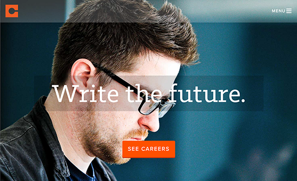
One way to make text stand out better from the photo is to blur the photo in the background.
Rock on.


There's always the text mask, which works well with thick characters.


A mobile phone screen design.  The shapes again - some almost transparent.  Even the menu bar.... 
Notice the orange contrast with the complementary blue-ish background.  Two very different typefaces.


Even though the type is very thin, it is large and has enough contrast
of color, texture, and line to set it off from the background.


Choosing The "Right" Font

This is a really useful guide with 5 principles for choosing fonts for your projects.  It also has a simplified breakdown of font groups with really good descriptions and examples of each.  Getting more familiar with this might save you (and me) some time scrolling through those font lists...

“What Font Should I Use?”: Five Principles for Choosing and Using Typefaces 
By Dan Mayer


Thursday, January 23, 2014

Remember your Web-safe fonts!

Using @fontface to include embedded fonts in our web pages has freed web designers from being restricted to using only the core web-safe fonts - fonts that almost everyone is sure to have on their computer when they view our pages in their browser.

Some of those core fonts, you may remember, are: Times New Roman, Georgia, Courier New, Arial, Verdana, Tahoma, Trebuchet MS, and (shudder) Comic Sans MS.

So, now we can just find cool fonts and embed them with no worries, right?  Welllll.... of course, it just can't be that easy.  There are still plenty of issues that can affect embedded fonts.

SO - the best practice if you use your own fonts is to continue to list fallback fonts (font stacks) consisting of the core web fonts and generic system fonts.

font-family:Brickz, Arial, Verdana, sans-serif;
This is an excellent article, laying out the issues with embedded fonts, and how to work around them, complete with lots of helpful examples:

http://sixrevisions.com/web-standards/why-we-still-need-web-safe-fonts/