Follow e-Communication on Facebook, Twitter, Pinterest, and eRavens.net! Student Resource: eRavens.blogspot.com!
Showing posts with label typography. Show all posts

Thursday, October 29, 2015

Free Fonts!

Carefully, now....

NO!  Just... no. Law firms are serious business.
A little knowledge is a dangerous thing. When it's knowledge of how to download and use fun fonts, the potential for abuse (choosing a font just because "you like it", without regard to how well it fits the project) is always there for new designers.


Still no. Traditional blah fonts don't fit Jimi.
So, to make me feel better about directing you to sites where you may download free fonts at will, I first present you with some advice. Always put thought and care into choosing fonts for your project. Fonts communicate a lot just on their own - apart from the actual letters and words they form.

The following sites contain good advice for choosing the perfect fonts for a project.

NOW go get 'em!

Here's a nice collection of free fonts I ran across recently:
101 best free fonts, fall 2015 (Webdesignerdepot.com)
Mrs. Lofquist found another compilation here:
100 Greatest Free Fonts Collection for 2015 (awwwards.com)


Choose fonts wisely you must.


Tuesday, March 10, 2015

Great Font Tool for Web

This is a really convenient and useful tool for finding out what fonts are used in websites!

WhatFont is a free Chrome or Safari extension and a Firefox bookmarklet. When activated you can point to any text on a web page to find out what font family it is, as well as size, line height, and color. I use it quite often!

It's available from the developer at his site: WhatFont Tool


Wednesday, December 17, 2014

One space or two between sentences?

On Blogger it's ONE.

Cutting to the chase...

In the one versus two space debate -- practically speaking, if you use two spaces between sentences in your Blogger pages or posts, they will sometimes wrap, causing some lines of continuing text to be indented by one space. So - for Blogger anyway, only use one space between sentences. (In Web design in general, multiple spaces are condensed down to one anyway, so it doesn't matter. For some reason Blogger is different, and it inserts a code to force as many spaces as you want.)

Here's an illustration of Blogger's two-space issue in the following paragraph. The sentences are all separated by two spaces:

The beginning of the 3rd line has alignment issues, due to my 2nd space.

The Debate (Blogger aside)

Is it actually wrong to use two spaces between sentences?

Yes. And... no.

It depends on who you talk to!  And, it depends on the setting.  (Are you typing a Blog post, a letter, text for a poster, etc.?)  Believe it or not, it may also depend on the image you wish to convey of yourself.

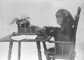
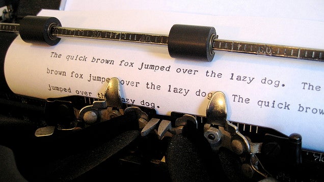
Two spaces between sentences was the convention in the days of the mechanical typewriter, which had monospaced characters.  It took two spaces after a period to give enough visual breathing room before the next sentence.

In the digital era, the two-space convention has lingered, even though it is not necessary (especially with those of us old enough to have learned to type on actual typewriters).


The Two-space Haters

www.cultofpedagogy.com/two-spaces-after-period/
These days, the convention is to use one space between sentences.  There are those who interpret this very strictly, and insist that using two spaces is very wrong. They have some good points.

One is Jennifer Gonzalez at Cult of Pedagogy.


Farhad Manjoo puts it this way in his essay on Slate.com (Space Invaders):
Typing two spaces after a period is totally, completely, utterly, and inarguably wrong.

The Official Word for Writers

The Chicago Manual of Style and the MLA Handbook both concur that the current convention for most situations is to use one space after a period.  They do, however, leave some wiggle room (www.mlahandbook.org/fragment/faq).
Publications in the United States today usually have the same spacing after a punctuation mark as between words on the same line. Since word processors make available the same fonts used by typesetters for printed works, many writers, influenced by the look of typeset publications, now leave only one space after a concluding punctuation mark. In addition, most publishers’ guidelines for preparing electronic manuscripts ask authors to type only the spaces that are to appear in print. 
Because it is increasingly common for papers and manuscripts to be prepared with a single space after all punctuation marks, this spacing is shown in the examples in the MLA Handbook and the MLA Style Manual. As a practical matter, however, there is nothing wrong with using two spaces after concluding punctuation marks unless an instructor or editor requests that you do otherwise.

For Graphic Designers and Desktop Publishers

Some graphic designers are among the strict one-space disciples.  Others will tell you that what matters is readability - and if two spaces look more readable than one in a certain situation, then use two. Here are some of the ins and outs of the issue at desktoppub.about.com, including this reasonable recommendation:
The Bottom Line: Professional typesetters, designers, desktop publishers, and anyone who truly cares about fonts and typography should use only one space after a period or other ending punctuation. However, it doesn't necessarily need to be a standard space character. Desktop Publishing software makes it easy to experiment with other space characters to achieve the best appearance on a case-by-case basis. Save the double spaces for typewriting, casual email, term papers (if prescribed by the style guide you are using), or personal correspondence. Learn how to remove extra spaces between sentences. For everyone else, do whatever makes you feel good.

Your Spaces Give You Away

One final consideration - when applying for a job with a company that is inclined to want younger folks as employees, you may want to stick with the one-space rule in your cover letter and resume. Typing two spaces between sentences identifies you as someone who probably learned typing back when the convention was two spaces.

Check these out:  Double Spacing After a Period Could Reveal Your Age  and Nothing Says Over 40 Like Two Spaces after a Period!

My Problem

I think that sometimes two spaces after sentences makes text more readable. However, I do want to change over to using just one -- on Blogger, I have to. There's a slight problem though....

9th Grade Typing Class, 1976
Spacing twice after sentences is a very difficult habit to unlearn. It was drilled into us repeatedly in 9th-grade typing class. Every period I have ever typed at the end of a sentence in the 38 years since then has been followed by two spaces. It's hard-wired into my brain and my muscle memory. You'll likely see evidence of that in many of my Blogger posts!

I have to concentrate really hard to make myself hit the space bar only once after a period. So, if you see me twitching slightly or making funny faces as I'm typing, you know why!


Wednesday, December 10, 2014

Typography Portraits Tutorials


Each of the tutorials below shows you how to make a different style of typography portrait. Each is about the same amount of work and takes roughly the same amount of time to complete. After you read the requirements below, pick the one that has the style of finished result you like best.

For the starting photograph, you have two options:
  • Find a free public-domain photo at a site like Morguefile.com here or here -- or -- 
  • We can take a new close-up photo of you. 

Whichever you do, the photo must be a close-up of a human face, must have good lighting and contrast, and should be big enough that it is easy to work with. (On Morguefile, click the "download" option to get the hi-res file.) You may not use the same starting photo as the tutorial.

If the tutorial says to download brushes or fonts, don't - just use fonts or brushes that are close in appearance.

Choose one of these tutorials of typography portraits:


Friday, September 12, 2014

Writing books -- by hand.

My e9 and sophomore Web Design classes have been looking at typography the last few days - and we talked a bit about how books were made before the invention of the printing press.

Wouldn't you know it?  Today I see this tweet from Colossal (https://twitter.com/Colossal):


The website they are recommending is a blog all about medieval books - with lots of beautiful examples of the writing and artistry:

http://medievalbooks.nl/

We'll be looking at this site during class next week for sure!


If you aren't already following Colossal, check them out.  Their website is: http://www.thisiscolossal.com/ 
Lots of great stuff for designers, artists, thinkers, and people who just like to look at cool stuff.  Very inspiring!


Tuesday, September 2, 2014

Designing graphics with large type over large photos

I've been looking for ideas for a graphic I've volunteered to make for my church.  It's going to have a photo in the background, and large text over the top.  Since this type of graphic is becoming much more common in web design (it has been common in graphic design for quite a while), I thought I'd post some of the ideas and resources I found here so you can get some ideas and inspiration when you have a similar project.

Type Tips


First, you need to know a couple of basic things about type, so you choose your fonts wisely:


Type-on-a-photo Tips and Examples


More Examples

Most of these use one or more of the techniques presented above.  The sites above also have great examples, so don't miss those.


Mr. Christie is a big guy, with a big political presence. 
By placing TIME behind him, this is emphasized even more.


This one also puts the big hair in front of some of the text. 
The text here makes great use of size contrast. 
Also notice the complementary color contrast.

 
Adding shapes to put text in.  Contrasts in size, typeface, and color!


This time the shape is less formal, and is partially transparent. 
Combine that with the casual typeface, and it fits the rustic photo perfectly.


One way to make text stand out better from the photo is to blur the photo in the background.
Rock on.


There's always the text mask, which works well with thick characters.


A mobile phone screen design.  The shapes again - some almost transparent.  Even the menu bar.... 
Notice the orange contrast with the complementary blue-ish background.  Two very different typefaces.


Even though the type is very thin, it is large and has enough contrast
of color, texture, and line to set it off from the background.


Choosing The "Right" Font

This is a really useful guide with 5 principles for choosing fonts for your projects.  It also has a simplified breakdown of font groups with really good descriptions and examples of each.  Getting more familiar with this might save you (and me) some time scrolling through those font lists...

“What Font Should I Use?”: Five Principles for Choosing and Using Typefaces 
By Dan Mayer


Tuesday, October 22, 2013

Comic Sans haters - chill and check this out

Poor Comic Sans MS... why do the designers hate it so?

Well, it turns out that it is true that Comic Sans really is not the best-designed typeface in the world, but -- it is just a typeface.  The issue for most Comic Sans haters has more to do with its overuse and its inappropriate use.  Just as you wouldn't use Times New Roman for a kid's birthday invitation, you shouldn't use Comic Sans in an ad for a financial planning firm.

Here's a video I found today on the bancomicsans.com website.  Besides getting a better perspective on the Comic Sans issue, I also learned 2 or 3 new things about typography in general! Check it out:


Have a nice day!