Follow e-Communication on Facebook, Twitter, Pinterest, and eRavens.net! Student Resource: eRavens.blogspot.com!
Showing posts with label graphic design. Show all posts

Thursday, October 29, 2015

Free Fonts!

Carefully, now....

NO!  Just... no. Law firms are serious business.
A little knowledge is a dangerous thing. When it's knowledge of how to download and use fun fonts, the potential for abuse (choosing a font just because "you like it", without regard to how well it fits the project) is always there for new designers.


Still no. Traditional blah fonts don't fit Jimi.
So, to make me feel better about directing you to sites where you may download free fonts at will, I first present you with some advice. Always put thought and care into choosing fonts for your project. Fonts communicate a lot just on their own - apart from the actual letters and words they form.

The following sites contain good advice for choosing the perfect fonts for a project.

NOW go get 'em!

Here's a nice collection of free fonts I ran across recently:
101 best free fonts, fall 2015 (Webdesignerdepot.com)
Mrs. Lofquist found another compilation here:
100 Greatest Free Fonts Collection for 2015 (awwwards.com)


Choose fonts wisely you must.


Wednesday, December 10, 2014

Free Textures

Some nice free textures (and fonts and photos) are available for download at this site:

http://designinstruct.com/category/free-resources/  


More good leather textures here:

http://designmodo.com/leather-textures/

2 Free Fonts for Graphic Design

Here's a nice bold one called "Intro":

http://fontfabric.com/intro-free-font/     
And, for contrast, something very different. I'm really liking this font - It's ornate, but in a grungy sort of way...

http://www.cuttyfruty.com/

The Process of Logo Design

Like any kind of design you might do for a client, logo design is very much a process.

original sketches for the Brainstorm9 logo
These designers take you through the process of designing a logo for a client from start to finish!

These two show specific examples of going from a sketch to an Adobe Illustrator Logo

Some famous logos and the famous designers behind them:


Choosing Colors in Web or Logo Design

You've been to colorschemedesigner.com to use the color wheel and other tools for picking a complete color scheme.  And you've got a good handle on the hexadecimal color codes, so now what?

Before you choose a color scheme for your next logo, website, poster, etc., there is more to consider: Colors have meaning. A color's meaning may have its roots in history, culture, or psychology - and these are deep strong roots that you need to work with, instead of against, when you choose colors. Some of it will seem common sense or intuitive - but other aspects of color meaning are more subtle.

Check out this site: ColorMatters.com - especially the sections under "The Meanings of Colors", and "Why Color Matters".

Also read the "Effective Use of Color Psychology in Web Design" page at NaldzGraphics.

Your colors should fit into a harmonic scheme, but they should also be the best possible fit for the product, company/organization, website and for the target audience.  Use color to effectively convey the meanings or associations that you want to get across - and to reach your viewers in the most impactful way.


Content-Aware Fill Tutorial and Project

Greetings! Today your mission is:

Part 1:

Get the starting image by clicking the thumbnail to the left and saving the big version - it does not exist at the download link in the tutorial anymore.


At the end of this post is the link to the tutorial. Follow the tutorial to change this image. DO the steps 6 and 7 - cropping and adjusting the color curves.

Save your image for web as a JPG High.

Part 2:

Pick any 2 of the following images, and do the same process as in the tutorial - remove the object specified, and adjust the color curves. Save for Web as JPG High:

Remove one of the guys.
Don't forget his shadow/reflection
and his rope.
Remove the picnic table.
Remove either one
of the palm trees.


Part 3:

Get into your student email and email your 3 images to me as attachments: molsononw@olatheschools.org .


Content-Aware Fill Tutorial:

Sea Lion Photobomb
Here's a refresher on that handy-dandy new feature in Photoshop CS5 that helps make it easier to remove a person or object from a photo - say, that old boy/girl friend, your annoying little brother or sister, the car that drove by at precisely the wrong moment, etc...


http://www.netglos.com/how-to-remove-a-person-from-a-photo-by-using-cs-5-content-aware/


Text Effects Tutorials for Making Web Banners (Photoshop)

A couple of collections of tutorials for making banner text in Photoshop:

http://sixrevisions.com/graphics-design/photoshop_text_effect_tutorials/

http://psd.tutsplus.com/category/tutorials/text-effects-tutorials/?tag=tips


Typography Portraits Tutorials


Each of the tutorials below shows you how to make a different style of typography portrait. Each is about the same amount of work and takes roughly the same amount of time to complete. After you read the requirements below, pick the one that has the style of finished result you like best.

For the starting photograph, you have two options:
  • Find a free public-domain photo at a site like Morguefile.com here or here -- or -- 
  • We can take a new close-up photo of you. 

Whichever you do, the photo must be a close-up of a human face, must have good lighting and contrast, and should be big enough that it is easy to work with. (On Morguefile, click the "download" option to get the hi-res file.) You may not use the same starting photo as the tutorial.

If the tutorial says to download brushes or fonts, don't - just use fonts or brushes that are close in appearance.

Choose one of these tutorials of typography portraits:


Tuesday, September 2, 2014

Designing graphics with large type over large photos

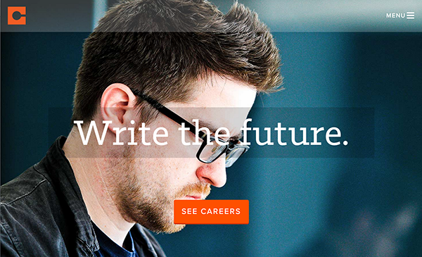
I've been looking for ideas for a graphic I've volunteered to make for my church.  It's going to have a photo in the background, and large text over the top.  Since this type of graphic is becoming much more common in web design (it has been common in graphic design for quite a while), I thought I'd post some of the ideas and resources I found here so you can get some ideas and inspiration when you have a similar project.

Type Tips


First, you need to know a couple of basic things about type, so you choose your fonts wisely:


Type-on-a-photo Tips and Examples


More Examples

Most of these use one or more of the techniques presented above.  The sites above also have great examples, so don't miss those.


Mr. Christie is a big guy, with a big political presence. 
By placing TIME behind him, this is emphasized even more.


This one also puts the big hair in front of some of the text. 
The text here makes great use of size contrast. 
Also notice the complementary color contrast.

 
Adding shapes to put text in.  Contrasts in size, typeface, and color!


This time the shape is less formal, and is partially transparent. 
Combine that with the casual typeface, and it fits the rustic photo perfectly.


One way to make text stand out better from the photo is to blur the photo in the background.
Rock on.


There's always the text mask, which works well with thick characters.


A mobile phone screen design.  The shapes again - some almost transparent.  Even the menu bar.... 
Notice the orange contrast with the complementary blue-ish background.  Two very different typefaces.


Even though the type is very thin, it is large and has enough contrast
of color, texture, and line to set it off from the background.


Choosing The "Right" Font

This is a really useful guide with 5 principles for choosing fonts for your projects.  It also has a simplified breakdown of font groups with really good descriptions and examples of each.  Getting more familiar with this might save you (and me) some time scrolling through those font lists...

“What Font Should I Use?”: Five Principles for Choosing and Using Typefaces 
By Dan Mayer