Follow e-Communication on Facebook, Twitter, Pinterest, and eRavens.net! Student Resource: eRavens.blogspot.com!

Wednesday, October 7, 2015

Quote for the Day


Getting information off the Internet is like taking a drink from a fire hydrant.

-- Mitchell Kapor 

(Who is Mitchell Kapor?)


Monday, October 5, 2015

Make the content come alive!

The role of the musician is to go from concept to full execution. Put another way, it’s to go from understanding the content of something to really learning how to communicate it and make sure it’s well-received and lives in somebody else.


-- Yo-Yo Ma

(UX Design, anyone?)


Wednesday, September 30, 2015

Struggles - Quote of the Day

“Strength does not come from winning. Your struggles develop your strengths. When you go through hardships and decide not to surrender, that is strength.”

-- Arnold Schwarzenegger


Tuesday, May 5, 2015

e-Comm for life

When you take e-Communication classes, you aren't learning a subject, as much as a way to communicate - about anything. It's a lot like learning a new language - except this language lets you sense the world around you, think about it and feel it, and then communicate it to others with much more than words.


Share your passion

e-Communicate your passion!
e-Communication is how you can really reach people. What are you interested in?  What do you love doing? e-Communication gives you ways to share it with the world, when a vocabulary of words alone would be inadequate.

Not every e-Comm student is going to end up working in journalism, video entertainment, animation, graphic design, or web design. However, all of you will carry with you the skills from these areas to apply to any future career, hobby, or passion.


Noteworthy analogy

It's all about the drums.
To use my own experience as an analogy - music is what got me through junior high and high school. I earned my bachelors degree in music. By the time I finished that degree, I realized that I did not want to be a school music teacher. I taught lessons in a music store for a few years, while I tried out the life of a "full-time" professional musician. It didn't take long to decide that wasn't going to be my life-long career either. I finally got back to teaching school in other areas than music - BUT all my life there have been countless little ways that my music background has paid off. It's a hobby and a love. Through music, I can communicate wordlessly from parts of myself that are otherwise hidden and silent. I am able to donate my musical talents to good causes. My life experience would be much less rich, less interesting, less beautiful - without that background in music. e-Communication may turn out to be to you what music is to me.


Your superpowers

e-Comm may not turn into a life-long career for you, but it will stay with you - giving you enriched ways to see the world around you, and to communicate what you see and what you are passionate about. Your ability to get your ideas across through some combination of writing, video, animation, graphic design, and web design gives your communication extra range and impact.

You may have noticed e-Communication's new slogan this year:
Communicate, Collaborate, Innovate, DESIGN. 
This is the stuff that lasts, no matter what crazy new things happen with technology or software in your lifetime. We also hope you take away some project management and leadership skills, in addition to mastering the current technical content.


Use the Force!

Sure, we love to see e-Communication alumni make it as professional designers, animators, broadcasters, entertainers, and so on - but our goals go beyond that. We especially hope that all of our students take these skills, these different ways of seeing the world and communicating to others what you see, to enrich your everyday lives - and maybe even to change the world, regardless of your occupation.

Plus, there's always this, as Mrs. Morris puts it so succinctly:
"What we do is cool."

Mr. O


Tuesday, March 10, 2015

Great Font Tool for Web

This is a really convenient and useful tool for finding out what fonts are used in websites!

WhatFont is a free Chrome or Safari extension and a Firefox bookmarklet. When activated you can point to any text on a web page to find out what font family it is, as well as size, line height, and color. I use it quite often!

It's available from the developer at his site: WhatFont Tool


Tuesday, February 17, 2015

One Rule to Ring Them All

There are lots of photo composition rules (tips, guidelines, principles). But there is one that I think makes such an instant difference in the quality of your photos, and is also so easy to pull off, that I think of it as the king of all the rules. If you remember only one of the photo composition rules, make it this one.

It's your last evening at the beach before heading home. You take a photo:


9 out of 10 vacation photos of sunsets over the water look like this. It's beautiful. There’s nothing wrong with it.


But what if the photo was taken (or cropped later) like this?


Or… maybe like this?

How is the meaning, feeling, or emphasis different in each photo? 


Note the locations of the sun and the horizon line, and then take a guess what the name of this photo composition rule is!


The Rule of Thirds (cue the choir of heavenly angels).


The third photo above
Positioning important elements of your photos either 1/3 of the way up, down, or across makes a photo less static and more interesting.

The first photo above is beautiful, but it is just kind of... there. The second photo conveys to me the mystery of the ocean depths about to turn dark. It has more of a melancholy feeling, perhaps. The third photo is all about that expanse of glorious sky - and it has a more upbeat feeling. Both the second and third also have the sun moved out of the center. The only reason I chose to move it to the left was that the sky seemed more interesting over to the right of the sun, so I wanted to include more of that.


Just watch out for this one thing...


There is one thing to watch out for as you implement your new Rule of Thirds awareness. If your subject is a living thing, or even something inanimate that can be thought of as facing a certain direction, or moving a certain direction - then position that subject so it is facing or moving into the photo, and not out of it.

Seagull in the center


Seagull facing/flying into the photo


Seagull about to fly off the edge of the photo

It creates an uncomfortable feeling when you see it.  It might also make you think the photographer almost missed catching the gull in the picture.


Keeping subjects moving or facing into the photograph is actually another of the composition rules.

May the thirds be with you!

The Raven is facing into the photo.
I put the photo to the right of the paragraph
so it would also face into this blog post.


So, get in the habit of always envisioning those thirds when you take photos.  How you use them will determine the mood or the message your photo conveys, and it will usually be more interesting than just centering your subject (though there are exceptions).  Just make sure you position subjects at thirds that allow looking or moving into the photo.


Once more the other way:


The Raven is facing into the photo.
However, this time it is facing out of the blog post.
Not a huge deal, but it feels different, right?


So, get in the habit of always envisioning those thirds when you take photos.  How you use them will determine the mood or the message your photo conveys, and it will usually be more interesting than just centering your subject (though there are exceptions).  Just make sure you position subjects at thirds that allow looking or moving into the photo.


Monday, February 9, 2015

Don't be BLAH, use CARP!

Stuck in the blahs? 

Can't quite figure out what's missing to make your web page, poster, title screen, animation, history presentation, blog post, anything-you-make, look really great?

Chances are good you can fix it easily with a little attention to CARP!

Check out a quick refresher on our e-Comm student demonstration blog:

http://studentblogdemo.blogspot.com/2015/02/what-is-carp.html


Wednesday, December 17, 2014

One space or two between sentences?

On Blogger it's ONE.

Cutting to the chase...

In the one versus two space debate -- practically speaking, if you use two spaces between sentences in your Blogger pages or posts, they will sometimes wrap, causing some lines of continuing text to be indented by one space. So - for Blogger anyway, only use one space between sentences. (In Web design in general, multiple spaces are condensed down to one anyway, so it doesn't matter. For some reason Blogger is different, and it inserts a code to force as many spaces as you want.)

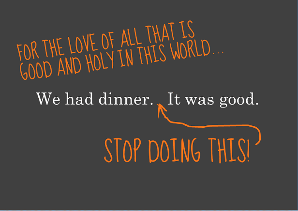
Here's an illustration of Blogger's two-space issue in the following paragraph. The sentences are all separated by two spaces:

The beginning of the 3rd line has alignment issues, due to my 2nd space.

The Debate (Blogger aside)

Is it actually wrong to use two spaces between sentences?

Yes. And... no.

It depends on who you talk to!  And, it depends on the setting.  (Are you typing a Blog post, a letter, text for a poster, etc.?)  Believe it or not, it may also depend on the image you wish to convey of yourself.

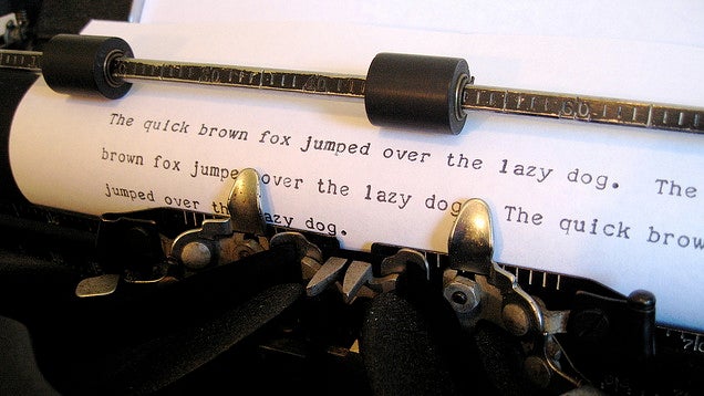
Two spaces between sentences was the convention in the days of the mechanical typewriter, which had monospaced characters.  It took two spaces after a period to give enough visual breathing room before the next sentence.

In the digital era, the two-space convention has lingered, even though it is not necessary (especially with those of us old enough to have learned to type on actual typewriters).


The Two-space Haters

www.cultofpedagogy.com/two-spaces-after-period/
These days, the convention is to use one space between sentences.  There are those who interpret this very strictly, and insist that using two spaces is very wrong. They have some good points.

One is Jennifer Gonzalez at Cult of Pedagogy.


Farhad Manjoo puts it this way in his essay on Slate.com (Space Invaders):
Typing two spaces after a period is totally, completely, utterly, and inarguably wrong.

The Official Word for Writers

The Chicago Manual of Style and the MLA Handbook both concur that the current convention for most situations is to use one space after a period.  They do, however, leave some wiggle room (www.mlahandbook.org/fragment/faq).
Publications in the United States today usually have the same spacing after a punctuation mark as between words on the same line. Since word processors make available the same fonts used by typesetters for printed works, many writers, influenced by the look of typeset publications, now leave only one space after a concluding punctuation mark. In addition, most publishers’ guidelines for preparing electronic manuscripts ask authors to type only the spaces that are to appear in print. 
Because it is increasingly common for papers and manuscripts to be prepared with a single space after all punctuation marks, this spacing is shown in the examples in the MLA Handbook and the MLA Style Manual. As a practical matter, however, there is nothing wrong with using two spaces after concluding punctuation marks unless an instructor or editor requests that you do otherwise.

For Graphic Designers and Desktop Publishers

Some graphic designers are among the strict one-space disciples.  Others will tell you that what matters is readability - and if two spaces look more readable than one in a certain situation, then use two. Here are some of the ins and outs of the issue at desktoppub.about.com, including this reasonable recommendation:
The Bottom Line: Professional typesetters, designers, desktop publishers, and anyone who truly cares about fonts and typography should use only one space after a period or other ending punctuation. However, it doesn't necessarily need to be a standard space character. Desktop Publishing software makes it easy to experiment with other space characters to achieve the best appearance on a case-by-case basis. Save the double spaces for typewriting, casual email, term papers (if prescribed by the style guide you are using), or personal correspondence. Learn how to remove extra spaces between sentences. For everyone else, do whatever makes you feel good.

Your Spaces Give You Away

One final consideration - when applying for a job with a company that is inclined to want younger folks as employees, you may want to stick with the one-space rule in your cover letter and resume. Typing two spaces between sentences identifies you as someone who probably learned typing back when the convention was two spaces.

Check these out:  Double Spacing After a Period Could Reveal Your Age  and Nothing Says Over 40 Like Two Spaces after a Period!

My Problem

I think that sometimes two spaces after sentences makes text more readable. However, I do want to change over to using just one -- on Blogger, I have to. There's a slight problem though....

9th Grade Typing Class, 1976
Spacing twice after sentences is a very difficult habit to unlearn. It was drilled into us repeatedly in 9th-grade typing class. Every period I have ever typed at the end of a sentence in the 38 years since then has been followed by two spaces. It's hard-wired into my brain and my muscle memory. You'll likely see evidence of that in many of my Blogger posts!

I have to concentrate really hard to make myself hit the space bar only once after a period. So, if you see me twitching slightly or making funny faces as I'm typing, you know why!


Friday, December 12, 2014

New Blog Resource For e-Comm Students!

e-Comm is starting to put together a new blog about... blogging!

So far, it has some tutorials on how to do some of the things that make your blog look better.

Soon it will also have some tips and examples for writing good blog posts, along with other resources we find to pass along to you.

Check it out!  studentblogdemo.blogspot.com


Wednesday, December 10, 2014